

Time Series Classification
This post was originally part of the DataRobot Community. Visit now to browse discussions and ask questions about the DataRobot AI Platform, data science, and more.
This end-to-end walkthrough explains how to perform time series classification with DataRobot Automated Time Series (or AutoTS). Specifically, you’ll learn about importing data and target selection, as well as modeling options, evaluation, interpretation, and deployment.
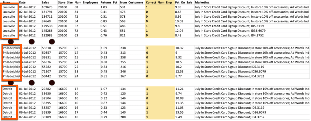
We are going to use this dataset from a company with ten stores to forecast whether or not they will be properly staffed for the next seven days. In the dataset the stores are stacked on top of each other in a long format. As you can see the data has a number of variables with different variable types such as date, numerical, categorical, and text. Three variables need to be highlighted:
- the Date column with days as the unit of analysis,
- the Correct_Num_Emp column, which is the target variable we want to forecast, and
- the Store column, which contains the names of the different stores we will be forecasting.
Uploading dataset and setting options
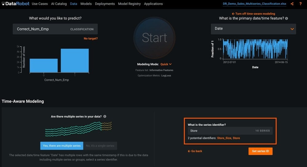
To create a time series classification model using DataRobot, you need to upload the dataset (through the new project page) and specify Correct_Num_Emp as the target column. Then you need to tell DataRobot that this is a time series problem by setting up time aware modeling (Set up time-aware modeling), selecting the date field, and selecting Time Series Modeling.
DataRobot has detected that this is a multiseries dataset and returns a list of potential variables to use for the series ID. In this case we will select Store, and click Set series ID (Figure 2).
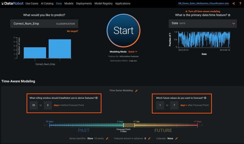
We need to tell DataRobot how far into the future we want to forecast, and how far into the past to go to create lag features and rolling statistics. We will leave the forecast distance of 1 to 7 days, and we will use the default feature derivation window (Figure 3).
Automated Time Series has a number of modeling options that can be configured. Here, we will look at the most commonly used options.
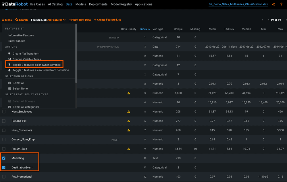
Known In Advance Variables
For time series projects we have the ability to indicate features we will know in advance, so DataRobot can also generate non-lagged features for these variables. We have three columns that will be known at the forecast point: Store_Size, Marketing, and DestinationEvent. Check the box next to each, then click Menu and select toggle as “known in advance” (Figure 4).
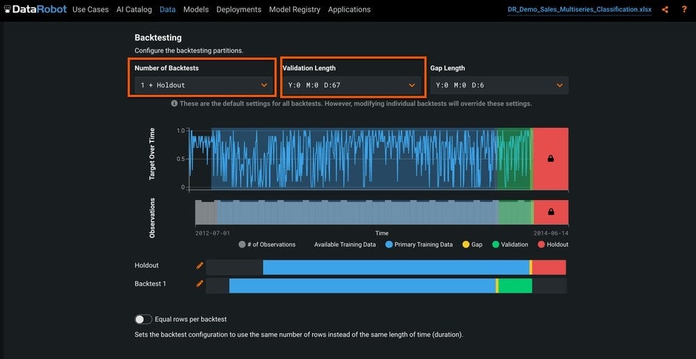
Backtests
Next is the option to partition the data. With time series, you can’t just randomly sample data into partitions. The correct approach is backtesting, which trains on historical data and validates on recent data. You can adjust the validation periods, as well as the number of backtests to suit your needs. We will use the defaults for this dataset, as shown in Figure 5.
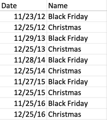
Event Calendar
DataRobot also allows you to provide an event calendar that will allow it to generate forward-looking features so that the model will be able to better capture special events. The event calendar for this dataset (Figure 6) consists of two fields: the date and the name of the event.
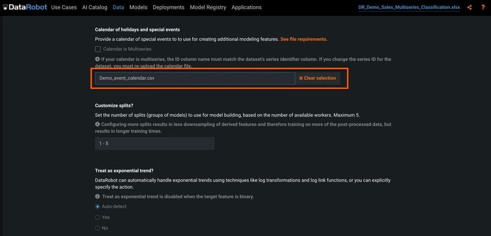
To add the event calendar, click the Time Series tab, scroll down to Calendar of holidays and special events, and drag and drop the calendar file (Figure 7).
There are many more options we could experiment with, but for now this is enough to get started.
Modeling
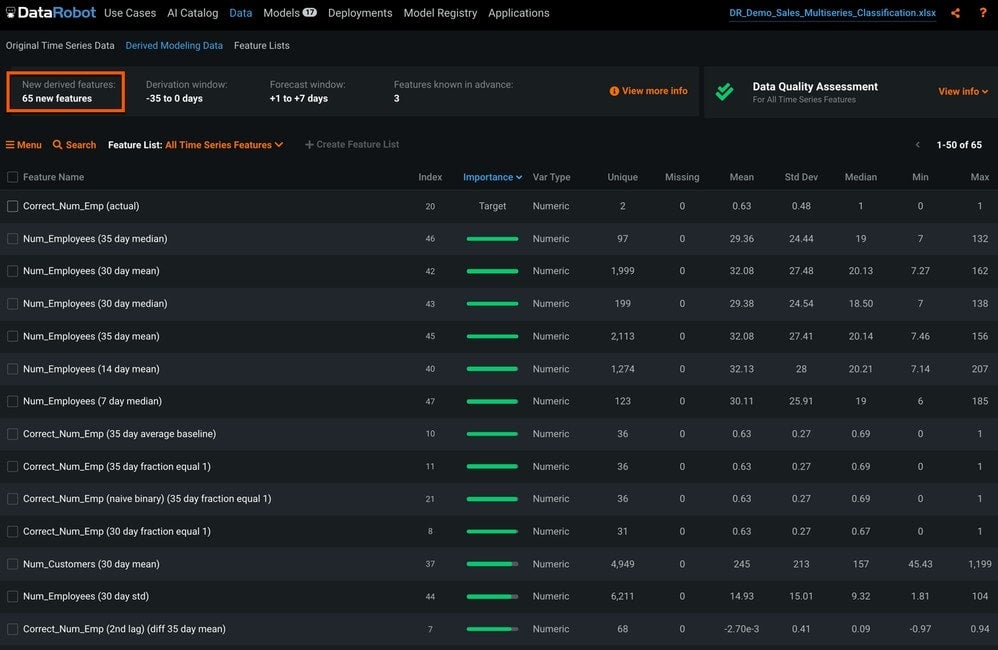
When we hit Start, DataRobot will take the 13 original features we gave it, and create dozens of derived features for the numeric, categorical, and text variables (Figure 8 shows 65 new features available when Autopilot starts).
After Autopilot completes we can examine the results of the Leaderboard, and evaluate the top-performing model across all backtests.
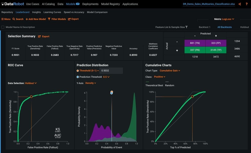
ROC Curve
On the ROC Curve tab (shown in Figure 9), we can check how well the prediction distribution captures the model separation. In the Selection Summary box, we have metrics such as the F1 score, recall, precision, and others. To the right is the well-known confusion matrix. At the bottom, we have the ROC Curve. This is followed by the Prediction Distribution, where you are able to adjust the probability thresholds. Lastly, we have the Cumulative Gain and Lift Charts, which tell you how many times the effectiveness increases, by using this model instead of a naive method.
Accuracy Over Time
In Figure 10 we can see the actual and predicted values plotted over time. We can also change the backtest and forecast distances so that we can evaluate the accuracy at different forecast distances across the validation periods.
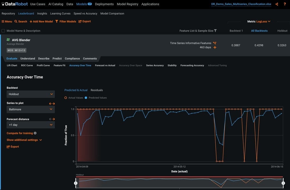
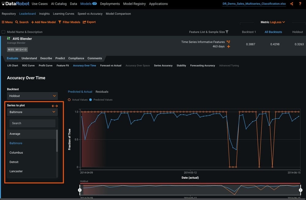
Figure 11 shows the option to see the accuracy over time for each series, or see the average across all series.
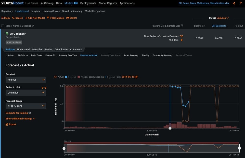
Forecast vs Actuals
On the Forecast vs Actuals tab (Figure 12), we can see how the forecast would be for any given forecast point in the validation period. This allows you to compare how predictions behave from different forecast points to different times in the future.
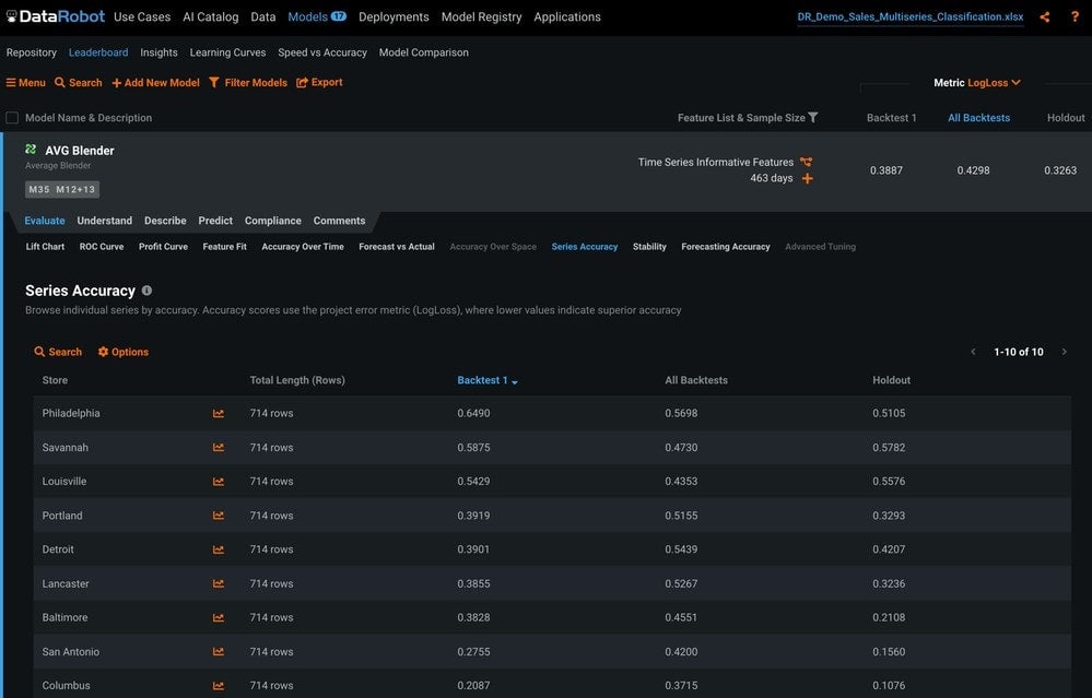
Series Accuracy
The Series Accuracy tab provides the accuracy of each series based on the metric we choose (Figure 13). This is a good way to quickly evaluate the accuracy of each individual series.
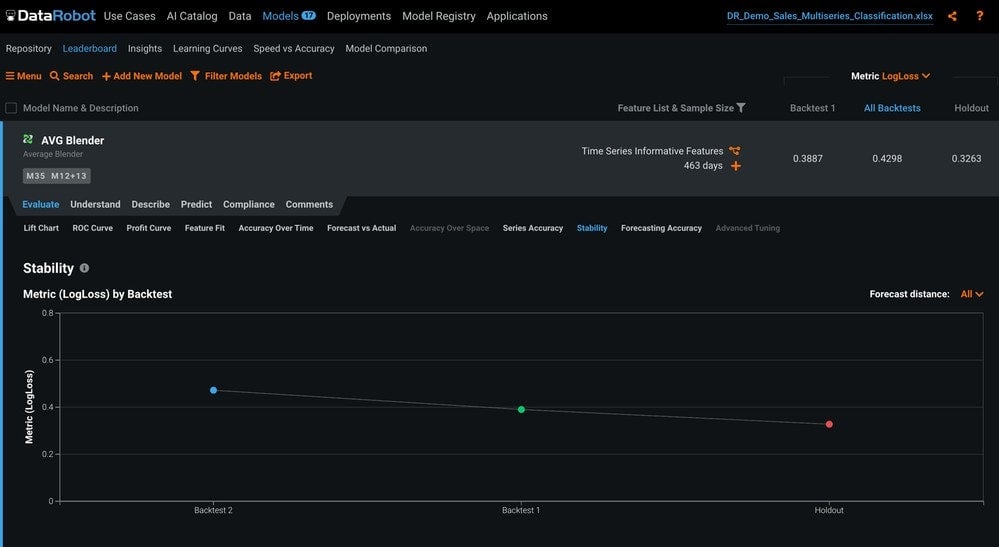
Stability
The Stability tab provides a summary of how well a model performs on different backtests to determine if it is consistent across time (Figure 14).
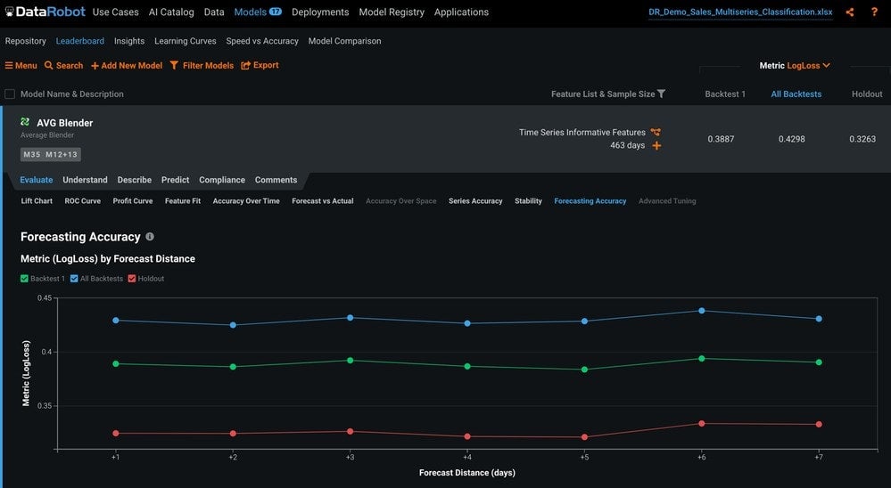
The Forecast Accuracy tab explains how accurate the model is for each forecast distance (Figure 15).
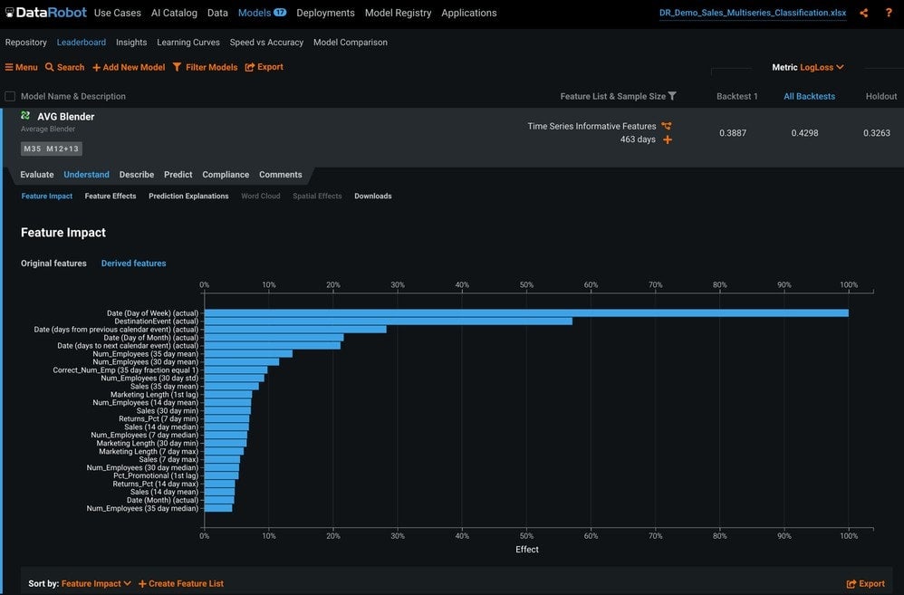
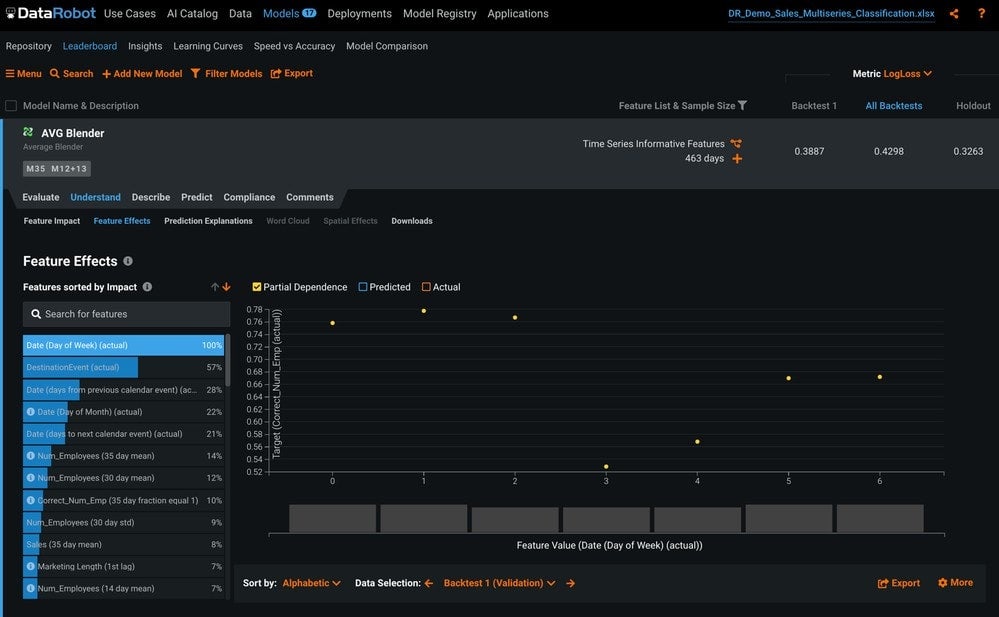
In the Feature Impact tab under the Understand tab (Figure 16) you can see the relative impact of each feature on your specific model, including the derived features.
The Feature Effects tab shows how changes to the value of each feature change model predictions.
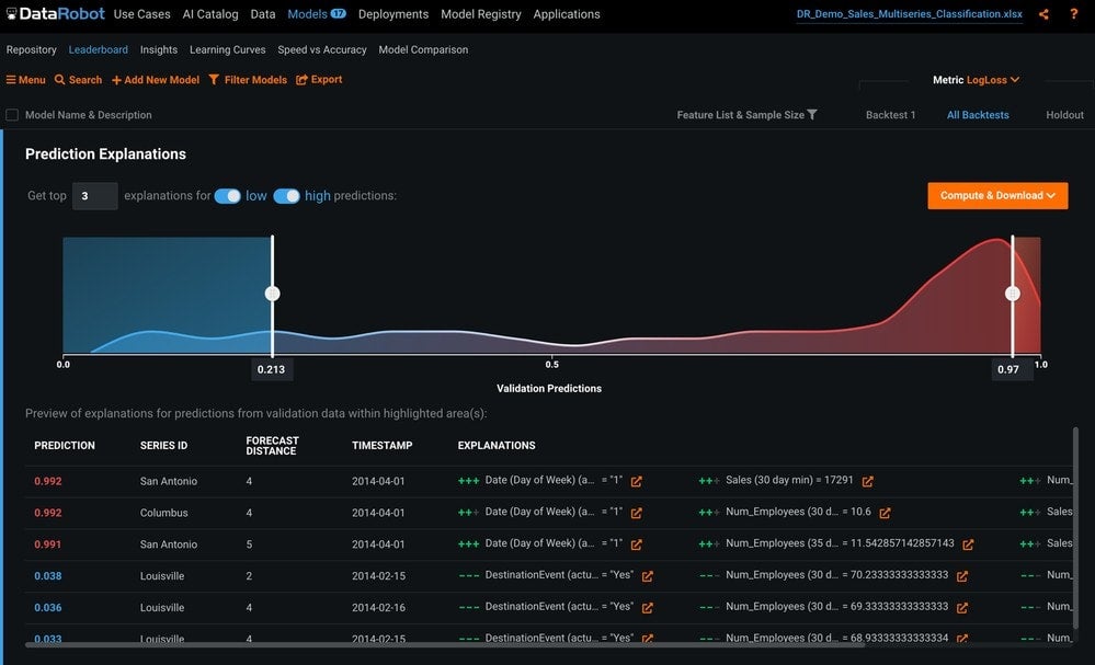
Prediction Explanations
Prediction Explanations tell you why your model assigned a value to a specific observation (Figure 18).
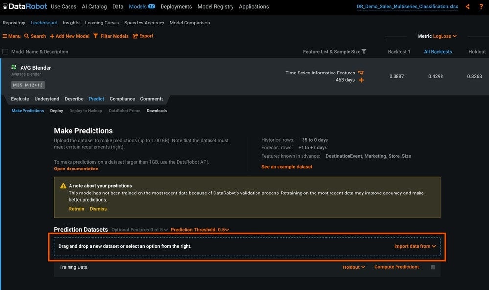
Predictions
Now that we have built and selected our demand forecast model, we want to get predictions. There are two ways to get time series predictions from DataRobot.
The first is the simplest: you can use the GUI to drag-and-drop a prediction dataset (Figure 19). This is typically used for testing or for small ad-hoc forecasting projects that don’t require frequent predictions.
The second method is to deploy a REST endpoint and request predictions via API (Figure 20). This connects the model to a dedicated prediction server and creates a dedicated deployment object.
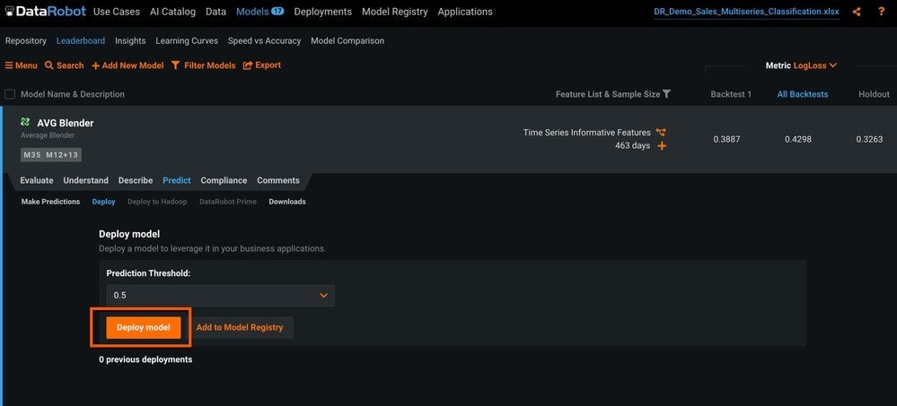
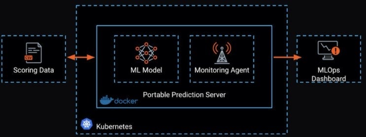
Finally, the third method is to deploy your model via Docker. This allows you to put the model closer to the data to reduce latency, as well as scale the scoring model as needed.
More Information
Search the DataRobot Platform Documentation for Time series modeling.

-
Belong @ DataRobot: Celebrating 2024 Women’s History Month with DataRobot AI Legends
March 28, 2024· 6 min read -
Choosing the Right Vector Embedding Model for Your Generative AI Use Case
March 7, 2024· 8 min read -
Reflecting on the Richness of Black Art
February 29, 2024· 2 min read
Latest posts
