

How to Understand a DataRobot Model: See Patterns The Model Found in Your Data [Part 5]
Imagine you are hiring a new staff member who will decide which personal loan applications a bank will accept and which it will not. So far, the interview is going well. You’ve asked the applicant which data fields are most important and they’ve answered income, credit rating and amount of the loan. Next, you ask them which credit rating values aren’t acceptable for loan acceptance and they confidently answer that applicants with the very highest credit scores, anything over 800, should be instantly rejected as bad risks. Would you give that person the job, or instead refer them to an introductory guide to credit rating scores?
It’s no different for an artificial intelligence (AI). Just as you wouldn’t hire a person who uses the wrong data values to make decisions, you should ask your AI which data values lead to high or low predictions, or yes or no decisions.
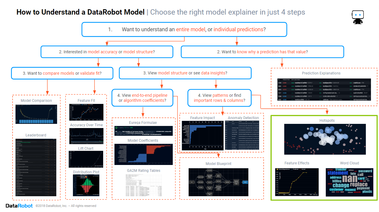
In the previous blog in this series, we found which columns and rows are important in the data. This time, we will focus on the section of the cheat sheet marked in green above. We will look at three key insights that enable you to quickly find which data values are important in each column, the patterns that the model has found in the data.
For some, finding patterns in data is the end-goal. They may want insights into customer behavior, the causes of equipment faults, or key drivers of personal loan risks. But the winners in the Fourth Industrial Revolution are those who have moved beyond insights, using those same models to automate decision making. Successful organizations build AIs that automatically offer the right product to the right customer, repair equipment before it fails, and approve loan applications.
Historically, finding the patterns used by a predictive model was easy because the models were simple. Some models were so simple that even an ordinary person could understand the mathematical formula e.g. distance = speed x time. These deceptively simple-looking models often took weeks to design, as statisticians had to follow a trial-and-error process to find the best equation for each pattern in the data. But such simple models didn’t deliver the accuracy required to remain competitive. So, data scientists developed more complex algorithms. Many of these modern complex algorithms use a formula that is thousands of lines long, so long that even the most mathematically adept person can’t read and interpret the entire formula at once.
In the modern AI-driven organization, insights are used to decide whether an AI can be trusted enough to be deployed into production. The patterns the model found in the data are used for common sense checks (e.g. do higher credit scores make a loan application more likely to be accepted?) and providing human-friendly explanations of new models to management.
Hot Spots
Data analysts want to quickly determine whether it is possible to predict different outcomes within the data. Before diving into complex models with complex patterns, it can be helpful to start with simple heuristics. These heuristics are simple data filtering rules that quickly find data segments having different outcomes to the average. If simple heuristics are successful, then other more complex models are likely to be successful. Heuristics are also useful for communicating key effects to non-technical colleagues. To see heuristics, you will want to look at hot spots.

Above are the hot spots for Lending Club’s loan data, predicting which personal loans will go bad. Each circle is a subset of rows defined by heuristic rules. Dark red circles represent data segments with higher outcomes, i.e. a higher proportion of bad loans. Dark blue circles represent data segments with lower outcomes, i.e. a lower proportion of bad loans. White and pale circles have outcomes that are not much different from average outcomes. Note that a data row can appear in more than one circle. If the hotspots include both dark red and dark blue circles, then you know that it is possible to segment the data in such a way as to predict varying outcomes. Moving the mouse of a hotspot shows the heuristic rules, the average outcome and the proportion of data rows lying within the hot spot.
How to Interpret the Hot Spots Above:
- There are several dark red circles and a couple of blue circles. This means that it is possible to predict differences in loan outcomes, although this may be easier for loans with poor outcomes than for especially good loan risks.
- Looking at one of the high-risk hot spots, we see that the heuristic rules are that the debt to income ratio is less than or equal to 16.22% and also the applicant’s line of credit usage exceeds 80.35% of the limit. This is an interesting interaction effect. Usually, we expect applicants with a low debt-to-income ratio to be good risks, and we expect applicants that maxout their line of credit to be bad risks. When seen concurrently, the applicant is a bad risk.
Feature Effects
Thanks to feature impact, you already know which input feature columns are the most important. The next step is to discover what your model is doing with each of these important input features, the patterns the model found that are driving its predictions and decisions. The patterns the model found in the data may help you prevent unwanted bias and discrimination, plus they may suggest further investigations and/or data preparation steps. To understand how a model is using non-textual features, you will want to look at the feature effects.
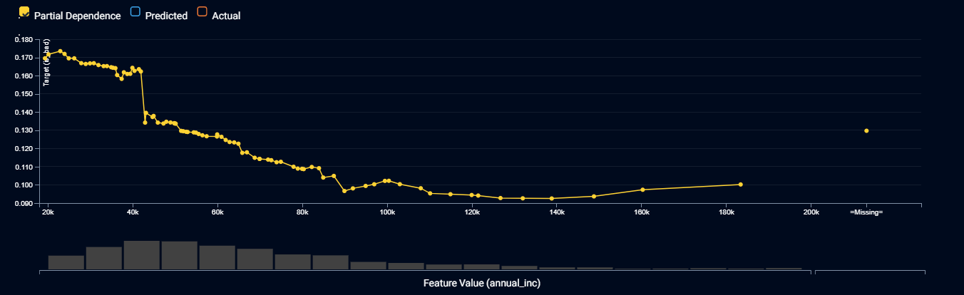
The plot above shows the feature effects for a model that predicts the probability of a personal loan going bad, drilling down by the applicants’ annual income. The yellow line shows how the prediction changes on a typical data row as you change the value of income. There are no absolute rules for what is right or wrong. You need to apply your human understanding of the business rules, general knowledge and common sense to decide whether the pattern is suitable. In particular, you will typically pay attention to the slope (which input values result in higher or lower predictions) and the smoothness of the pattern.
How to Interpret the Feature Effects Above:
- The probability of a loan going bad generally reduces as the applicant’s income increases. This makes sense. We would not trust the model if it said that higher incomes were poorer risks. The risk stops improving once incomes exceed $100,000 per annum (pa). This also makes sense, as once an applicant has more than enough money to repay a loan, any extra income won’t make much of a difference.
- While the pattern generally slopes downward from left to right, there are income ranges where it temporarily slopes upward. As we don’t expect this from our general knowledge, we may conclude, after investigation, that it is due to random luck in the data. If these small bumps in the general pattern are too problematic for your organization’s business processes, you would conclude that this model is not suitable, and look for a more suitable model in the DataRobot leaderboard. Another option, for advanced users, is to apply DataRobot’s monotonicity constraint settings to force the model to never slope upward.
- There is a sudden drop in risk when income is $42,000 pa that may be an artifact of Lending Club’s loan acceptance criteria, with different acceptance criteria for applicants below and above this income threshold. This insight warrants further investigation because if it proves to be a replicable effect, it could be used to optimize your lending strategy.
Word Clouds
While feature effects tell you about patterns a model used for non-text input features, word clouds tell you about patterns a model used for free-text input features. Word clouds show the words and phrases that drive predictions.

Above is a word cloud of the injury description an insurer’s workers’ compensation claims, predicting the total payout for each claim. Dark red words and phrases are associated with higher predictions, while dark blue words and phrases are associated with lower predictions. The size of the font indicates how frequently a word or phrase appears in the data. Since a text field contains multiple words and phrases, the prediction is determined by the balance of red and blue words and phrases in the data field. When reviewing a word cloud, you will apply common sense checks, and look for words that should be merged together in data pre-processing.
How to Interpret the Word Cloud Above:
- Injury descriptions containing phrases such as “lower back”, “fractured” or “knee” are likely to cost more to settle. This makes sense, and back and joint injuries can be debilitating and difficult to treat.
- Injury descriptions containing the phrases “eye”, “left eye” or “right eye” are likely to not cost much. This is not what one would initially expect, but detailed investigations of the data show that the eye injuries are caused by workers getting dust in their eyes when using a grinder, and this is easily treated by flushing the eye.
- The words “laceration” and “lacerated” appear frequently, with similar effects. You may wish to apply stemming in your data pre-processing to change these words to always be the same tense.
Conclusion
The path to trusting an AI includes knowing whether the patterns it is using are suitable and reasonable, and knowing which input features the model is using to determine high or low predictions and yes or no decisions. The path to building an AI involves training multiple machine learning algorithms to find the one that best suits your needs, and the only practical way for you to quickly find the model using the most suitable patterns, across dozens of models, is to use automated machine learning, which shows you the feature effects and word cloud for each and every algorithm. If your AI can’t tell you which data values drive its decisions, or what patterns it uses, then it’s time to update to DataRobot for models that you can trust. Click here to arrange for a demonstration of DataRobot’s human-friendly insights, showing how you can trust an AI.

Colin Priest is the VP of AI Strategy for DataRobot, where he advises businesses on how to build business cases and successfully manage data science projects. Colin has held a number of CEO and general management roles, where he has championed data science initiatives in financial services, healthcare, security, oil and gas, government and marketing. Colin is a firm believer in data-based decision making and applying automation to improve customer experience. He is passionate about the science of healthcare and does pro-bono work to support cancer research.
-
Belong @ DataRobot: Celebrating 2024 Women’s History Month with DataRobot AI Legends
March 28, 2024· 6 min read -
Choosing the Right Vector Embedding Model for Your Generative AI Use Case
March 7, 2024· 8 min read -
Reflecting on the Richness of Black Art
February 29, 2024· 2 min read
Latest posts
