

How to Understand a DataRobot Model: Quickly Find What’s Important in Your Data [Part 4]
Have you ever been guilty of confirmation bias, the tendency to interpret new evidence as confirmation of one’s existing beliefs or theories? Let’s admit it. We have all been guilty of this cognitive bias, even those of us who like to think that we are data-driven.

At Gartner‘s 2016 “BI Bake-Off” at the Data and Analytics Summit in Dallas, Texas, Gartner gave representatives of several software vendors a set of university and college student demographic data and payroll data. They asked the vendors to derive insights about which university graduates would have the most earning power 10 years after graduation. The college scorecard data was complex, with approximately 2,000 variables available to explore manually. With limited time to do the analysis, the data analysts did what expert analysts typically do and explored their own hypotheses first. In doing so they all drew the same obvious conclusion (attending a leading university leads to higher incomes), but missed the strongest driver – the parental incomes of the students.
How often do business people draw suboptimal conclusions from their data? With dataset sizes getting larger and larger, with more and more input features, it is tempting to create a dashboard that shows the relationships for the key input features that we believe will matter the most. How many times might there be other more important factors that we did not think to explore?
“When the data is complex, large and highly dimensional (even just 10 or more columns), users either focus their time on exploring their own hypotheses in a subset of the data, or must manually explore all possible combinations and permutations to ensure a complete and accurate result. This can be very time-consuming. In many cases, therefore, users default to the former approach for expediency; or they may not even know all the possible permutations to explore. As such, they are likely to miss important insights and relationships.” — Augmented Analytics is the Future of Data and Analytics, Gartner
In the last two blogs in this series (part 2 and part 3), we looked at how to assess and understand the accuracy of DataRobot models. This time we look at how to use DataRobot to automatically discover what is important in your data.
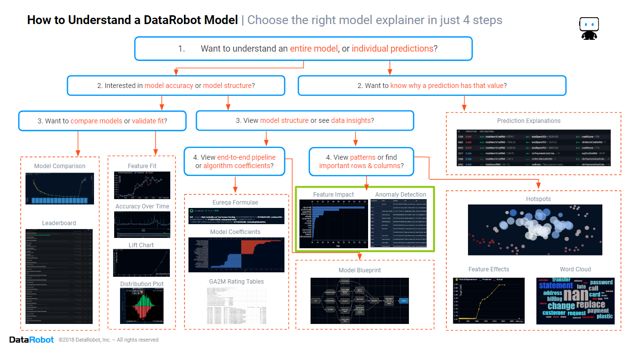
In this blog, we will focus on the section of the cheat sheet marked in green above. We will look at the two main insights that enable you to quickly find which rows and columns are most important.
Historically, finding the most important rows and columns was easy because you only had small datasets, with maybe only a dozen columns and a couple of dozen rows. A statistician could manually test the statistical significance of columns, then manually flag rows with results that are outliers, or rows having high leverage. But as datasets get wider and longer, manual identification of important rows and columns becomes too time-consuming and error-prone. The days of manually finding what is important are ending. Automated machine learning is a game changer, removing the need for manually searching through wide datasets, and providing human-friendly insights without the statistical jargon of p-values and Z-scores.
Feature Impact
Modern datasets can have thousands of columns. Manufacturers have thousands of sensors along their production lines. Marketers use hundreds of Google AdWords search terms, plus a huge range of demographic and behavioral features for each customer. Healthcare providers have thousands of possible medical diagnostic results, diagnosis codes, and treatments in their databases. Data analysts are expected to know which columns to include in performance dashboards, whether any key inputs are causing issues with bias, to justify the cost of external data sources, and to apply common sense checks. It is a challenge for those data analysts to avoid being overwhelmed by the tsunami of data, and develop valuable insights in a timely manner. To find important columns in a dataset, you will want to see their feature impact.
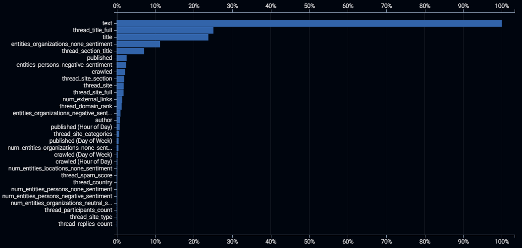
Above is the feature impact for a model that predicts which news stories will go viral i.e. which online new stories will be shared the most across social media. The blue bars show the relative importance of each input feature, ranked from the most important (scaled to 100%) to the least important (with importance close to, or equal to 0%). All importance values are relative to the top-ranked input feature. Input feature importance is specific to a model and will vary from model to model because each algorithm uses data in its own unique way. The feature impact is a ranking of how important each input feature is to the predictive power of a trained model. So it is always within the context of which target column value you are trying to predict.
How to Interpret the Feature Impact Plot Above:
-
The first five input features have significantly higher values, and therefore have significantly stronger predictive power than the remainder of the input features. These 5 columns are the most important columns, the ones you are most likely to include in a management dashboard. These are also the five columns which we should prioritize for sensibility checking the patterns that the model found in the data. We will discuss where to find and how to interpret these follow-up insights in a later blog in this series.
-
The relative importance of the input columns makes sense compared to our expectations. For example, if the hour of the day that the website was crawled was the most important for predicting virality, we would be suspicious of the veracity of the data and/or the model. Similarly, if the title of the news story were determined to be of negligible importance, we would have less trust in the model.
-
The text of the new story is the dominant input feature for predicting virality, easily eclipsing the title of the news story. This indicates the virality is determined more by the detail of what is written than by the first impressions gained by the news headline.
-
All of this data was obtained via an external data subscription, so if we were paying extra for the unimportant columns, such as the site type (ranked second-last in the plot), then we may want to consider lapsing that subscription.
Anomaly Detection
Modern datasets can have millions of rows. Each row may be a customer, a product sold, or a payment transaction. Some of these rows of data may be more worthy of your attention than others. Machine learning models, which power most AIs, learn by example from your historical data. Since incorrect data may teach the wrong ideas, you want your AI to be trained by trustworthy data. Weird-looking data is therefore worthy of your attention, as it may be incorrect, or it may contain unexpected insights and ideas for further feature engineering. To find these rows we can look at the results of anomaly detection. Unlike feature impact (described in the previous section) anomaly detection is not specific to the target column values that you are trying to predict.
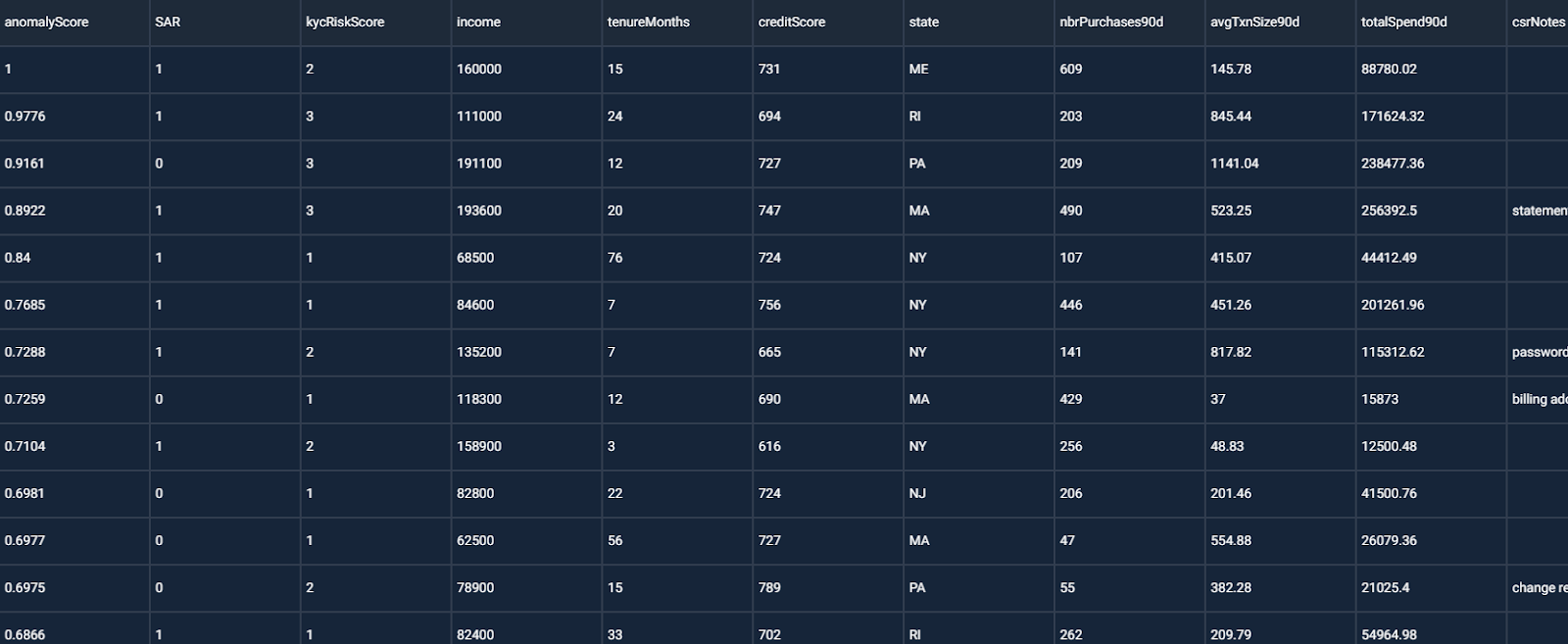
The screenshot above shows the anomaly detection results for a project that predicts whether a banking customer is a money launderer. The anomaly score lies within the range of 0 to 1, with a score of 1 meaning that a data row is very different to the other rows in the dataset, and a score of 0 indicating that there is nothing unusual in that data row. When we find an anomalous row, we look at the values for that row to find unusual values, particular values that appear to be errors. We may also be interested in seeing whether the anomaly scores are predictive of the target column outcomes.
How to Interpret the Anomaly Detection Table Above:
-
The first few rows’ values do not appear to contain errors. So the anomalies are not incorrect data.
-
Focusing on the first row of data, we see unusually high values for total spending, overpayments, refunds and merchant credits. These values are also high versus the customer’s income. This customer’s behavior is unusual.
-
The rows with higher ranked anomaly scores are highly likely to require a suspicious activity report (SAR). So anomalous behavior may be predictive of money laundering! We definitely want to keep such anomalous rows in the training data.
-
Since the anomalous behaviors have predictive power, it may be valuable to add new input features that make it easier to identify these anomalous behaviors, such as taking the ratio of spending versus income, and the ratio of overpayments, refunds and merchant credits versus spending.
Conclusion
The path to trusting an AI includes knowing whether the data it was trained on was suitable and reasonable, and knowing which input features the model is using the most. You can determine whether to trust an AI by discovering which rows and columns were most important in its training, whether it learned from appropriate examples. The path to building an AI involves training multiple machine learning algorithms to find the one that best suits your needs, and the only practical way for you to quickly find the important columns across dozens of models is to use automated machine learning, which shows you the feature impact for each and every algorithm.
With datasets becoming wider and longer, the only timely way for you to learn which rows and columns are important is to use automated machine learning, which runs anomaly detection on your data and flags the most unusual rows in the data. If your AI can’t tell you which inputs it considers important, and which it is mostly ignoring, then it’s time to update to DataRobot for models that you can trust. Click here to arrange for a demonstration of DataRobot’s human-friendly identification of what’s important in your data.


Colin Priest is the VP of AI Strategy for DataRobot, where he advises businesses on how to build business cases and successfully manage data science projects. Colin has held a number of CEO and general management roles, where he has championed data science initiatives in financial services, healthcare, security, oil and gas, government and marketing. Colin is a firm believer in data-based decision making and applying automation to improve customer experience. He is passionate about the science of healthcare and does pro-bono work to support cancer research.
-
How to Choose the Right LMM for Your Use Case
April 18, 2024· 7 min read -
Belong @ DataRobot: Celebrating 2024 Women’s History Month with DataRobot AI Legends
March 28, 2024· 6 min read -
Choosing the Right Vector Embedding Model for Your Generative AI Use Case
March 7, 2024· 8 min read
Latest posts
