

Explaining SHAP Insights in DataRobot
This post was originally part of the DataRobot Community. Visit now to browse discussions and ask questions about DataRobot, AI Platform, data science, and more.
The Shapley values is a popular method from coalitional game theory that tells us how to fairly distribute the “credit” among the features. The popularity of the method is growing thanks to the SHAP open source package. This article explains DataRobot SHAP insights (Shapley Additive exPlanations).
Strengths of SHAP
- Local accuracy: the sum of the feature attributions is equal to the output of the model we are trying to explain.
- Missingness: features that are already missing have no impact
- Consistency: changing a model so a feature that has a larger impact on the model will never decrease the attribution assigned to that feature.
How to access SHAP insights
Before starting your project, set up DataRobot to calculate SHAP insights in Advanced Options > Additional. For this example, we used the 10K Diabetes demo data to predict the number of lab procedures a patient may need.
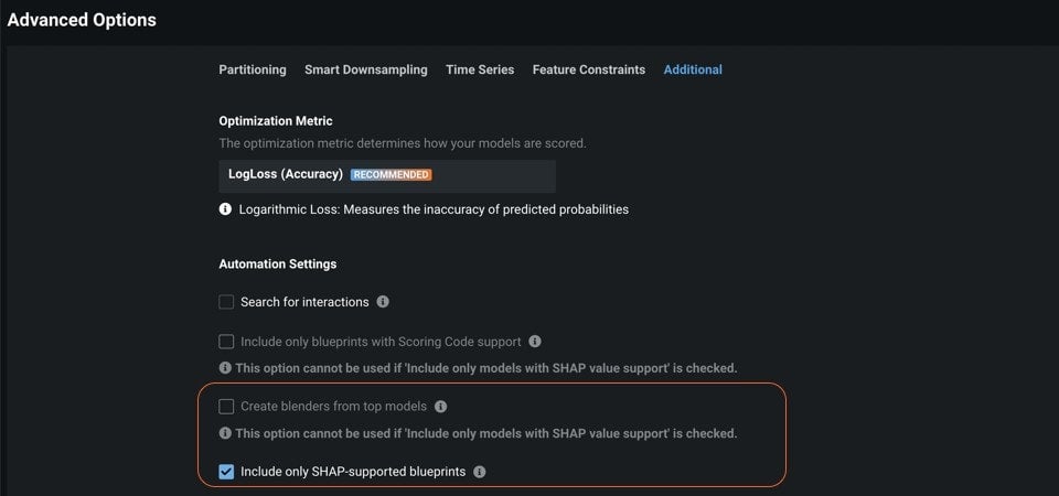
Uncheck the Create blenders from top models box, check the Include only SHAP-supported blueprints box, and click Start.
SHAP Feature Impact
You can investigate the models on the Leaderboard in the same way you would for any other DataRobot project. If you select a model and then select Understand > Feature Impact, you will see Feature Impact calculated with SHAP. This tells you which features are important in the model using SHAP. Calculating feature impact in this way is less sensitive to sample size and faster than prior methods.
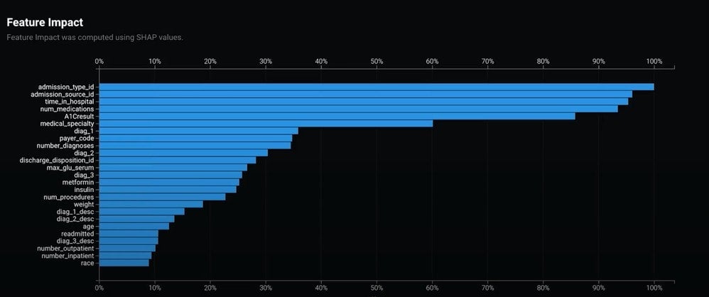
Find more information on SHAP Feature Impact in the DataRobot Public Documentation.
SHAP Prediction Explanations
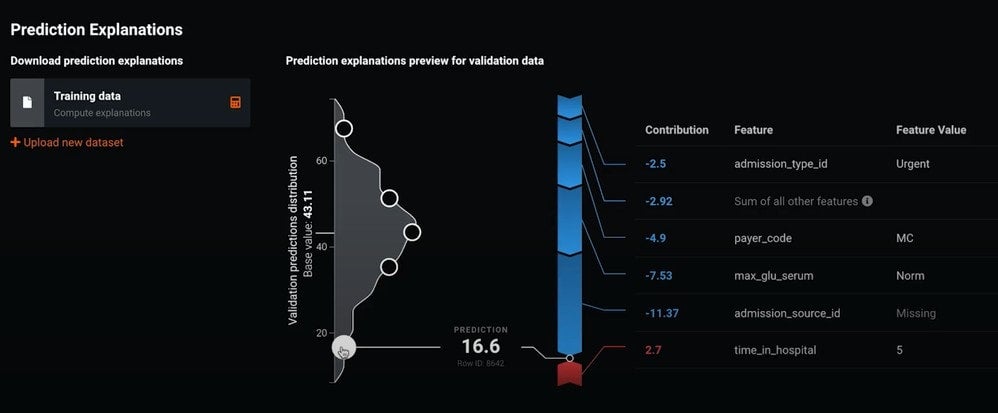
If you select Understand > Prediction Explanations, DataRobot calculates SHAP Prediction Explanations and then displays a visualization that provides a row-by-row understanding of why scores were indicated the way that they were. This is very useful for explaining your modeling to non-data scientists. The explanations include the influence of every potential feature and can be downloaded for every row in your dataset.
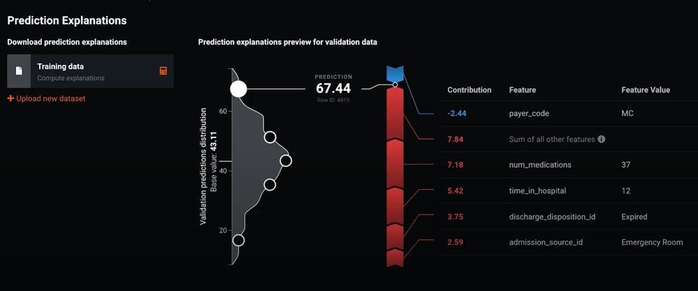
Figure 3 shows the SHAP scores for a sample of the data within the training distribution. When you look at the example near the top of the distribution, you will see that this observation has the highest prediction. To the right you can see each key feature’s contribution to that score. Features that are pushing the score higher are indicated in red, and those that are pushing the score lower are indicated in blue.
Figure 4 shows an observation at the other end of the distribution. The majority of key features in this case are indicated in blue and pushing the score lower, indicating fewer lab procedures.
If you have any questions about SHAP insights, click Comment and let me know.
SHAP vs XEMP
With the addition of SHAP, DataRobot now offers two ways to get Prediction Explanations. Before SHAP, the traditional approach in DataRobot was Exemplar based Model Predictions (XEMP), which differs from SHAP in how it calculates explanations.
XEMP uses “exemplars” to represent a baseline “typical” data value to explain how predictions differ from a typical value. No single input feature value can truly represent the full range of the data, so an exemplar uses a series of synthetic data rows comprising the range of values that an input feature can take, along with the consequent variations in predicted values. The strength of an explanation for a feature is then based on how much the predictions change as an input feature varies. Although this approach is model agnostic it does require many predictions for each explanation.
SHAP works by identifying the magnitude of impact for each feature for each observation of data. It does this by dividing the “credit” among the different features for a given prediction. For example if you are predicting the price of a house, SHAP will enable you to see how much each feature contributed to, or reduced, the predicted dollar amount. DataRobot supports SHAP for linear models, trees and tree ensembles, and multistage combinations of these. These implementations provide explanations very quickly, for every feature.
We recommend using XEMP for most use cases. SHAP is typically used when there are regulatory concerns because it is a widely accepted and open-sourced methodology. SHAP also can provide higher speed explanations and may return all the features.
More Information
Check out docs.datarobot.com for more information on SHAP-based Prediction Explanations, SHAP reference, and SHAP Feature Impact.
Also, within the SHAP reference topic see the section “Additivity in Prediction Explanations” to learn why sometimes SHAP values do not add up to the prediction.

-
How to Choose the Right LLM for Your Use Case
April 18, 2024· 7 min read -
Belong @ DataRobot: Celebrating 2024 Women’s History Month with DataRobot AI Legends
March 28, 2024· 6 min read -
Choosing the Right Vector Embedding Model for Your Generative AI Use Case
March 7, 2024· 8 min read
Latest posts
