


DataRobot Explainable AI: Machine Learning Untangled
In the past decade, we’ve seen an explosion in the usage of AI. From predicting which customers are likely to churn to forecasting inventory demand, businesses are adopting AI more and more frequently. With any AI solution, you want it to be accurate. But just as important, you want it to be explainable. It can be difficult to convince stakeholders at your organization to trust a model, even if it’s 90% accurate, if it’s unclear how a model arrives at decisions. Explainability requirements continue after the model has been deployed and is making predictions. It should be clear when data drift is happening and if the model needs to be retrained. DataRobot offers end-to-end explainability to make sure models are transparent at all stages of their lifecycle. In this post, we’ll walk you through DataRobot’s Explainable AI features in both our AutoML and MLOps products and use them to evaluate a model both pre- and post-deployment.
The Data
The dataset we’ll be using contains information about homes and their sales price. This is a complex dataset, containing image and geospatial features. The target we’re predicting is the sales price, meaning this is a regression problem.

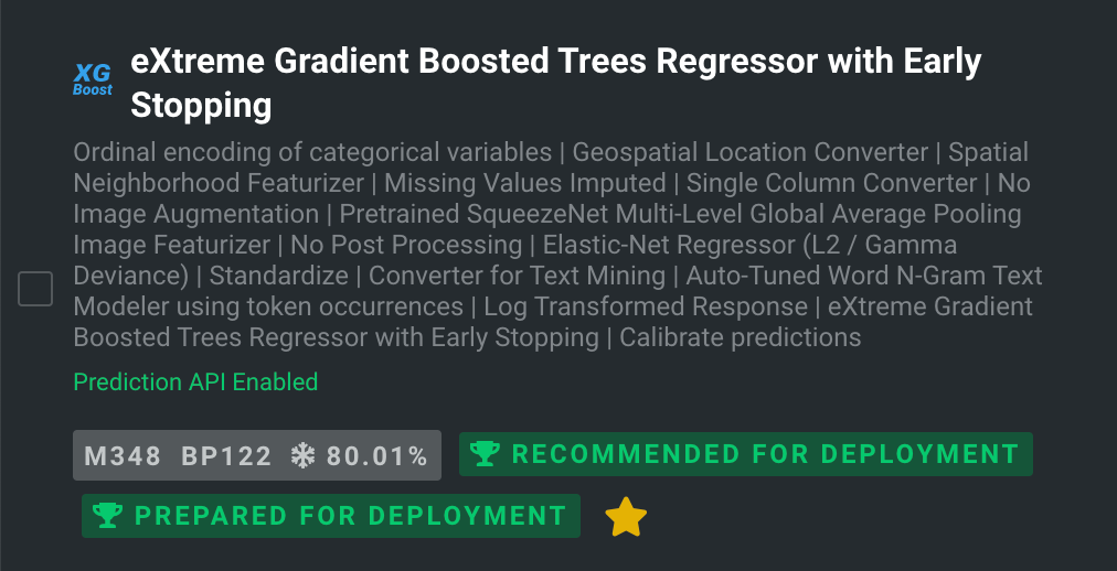
I’ve uploaded this dataset to DataRobot and built some models using our AutoML platform. I’ve selected an XGBoost model with a SqueezeNet image featurizer to evaluate.
MLDev Explainability
Some models have “built-in” features that make them easy to understand. For example, Linear Regression has coefficients that explain what effect each feature has on the model. Most models are more complicated than that, so we need to make them explainable with additional modeling techniques. Model explainability is typically grouped into the categories of Global Explainability and Local Explainability. Global Explainability allows you to understand the behavior of the model as a whole across all the training rows. Local Explainability tells you why the model made a certain prediction for an individual row.
Global Explainability
DataRobot offers many tools for Global Explainability. The tools that are available depend on your project type. Below are some of the most commonly used Global Explanation techniques available in DataRobot.
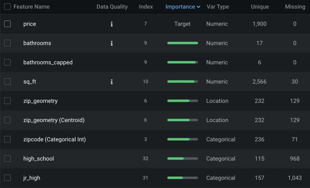
Feature Impact
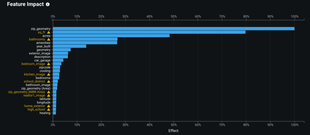
One of the first things people usually want to know about their model is which features are driving its decision-making the most. Feature Impact displays that information, listing the most important features to the model in descending order. DataRobot can use either Permutation Based Importance or SHAP Importance to compute importance.
In the example below, we see that the most important features to this model are zip_geometry, a geospatial feature that indicates the location of the home, and sq_ft, a numeric feature that indicates the square footage of the house.
Feature Effects
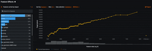
Now that we know which features are most influential to the model’s decision-making, the next question is how exactly do those features affect the model. By using Feature Effects, you can see how different values of a feature affect the model’s predictions. DataRobot uses a methodology called Partial Dependence to compute this.
Looking at Feature Effects for our model, we see that as the features sq_ft, acres, and bathrooms increase, so does the average predicted sales price. This matches a quick gut-check: the more square feet a home has the more expensive it typically is.
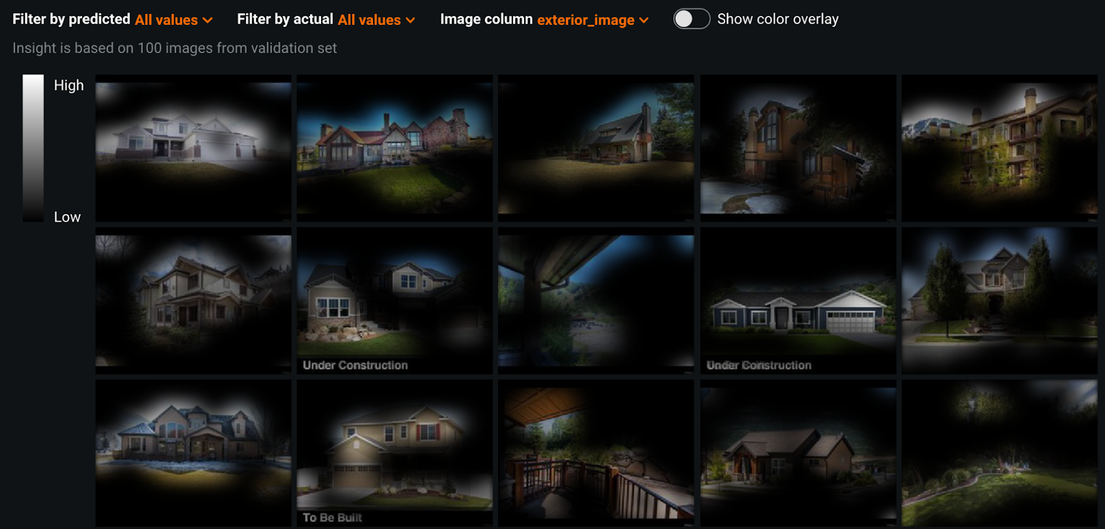
Activation Maps
Because our dataset contains image data, DataRobot used models that contain deep learning based image featurizers. Activation Maps allows us to see what part of images the model is using for making predictions. This can help us determine if the model is looking at the “right” place, such as the proper object in a classification model.
Looking at Activation Maps for our model, we can see that the model is looking at the entire house for the most part. In some cases, it seems to be identifying how many stories the house is.
Local Explainability
While Global Explanations describe the performance of a model overall, Local Explanations explain why a model made an individual prediction. This can be helpful when you need to justify the decision a model made. For example, why it denied someone a loan. Below we’ll cover how DataRobot implements Local Explainability.
Prediction Explanations
DataRobot Local Explanations are available via Prediction Explanations. This will tell you exactly which feature values contributed to a prediction and how much they contributed. DataRobot can use either SHAP explanations or our own XEMP explanations. These can be produced at training or scoring time.
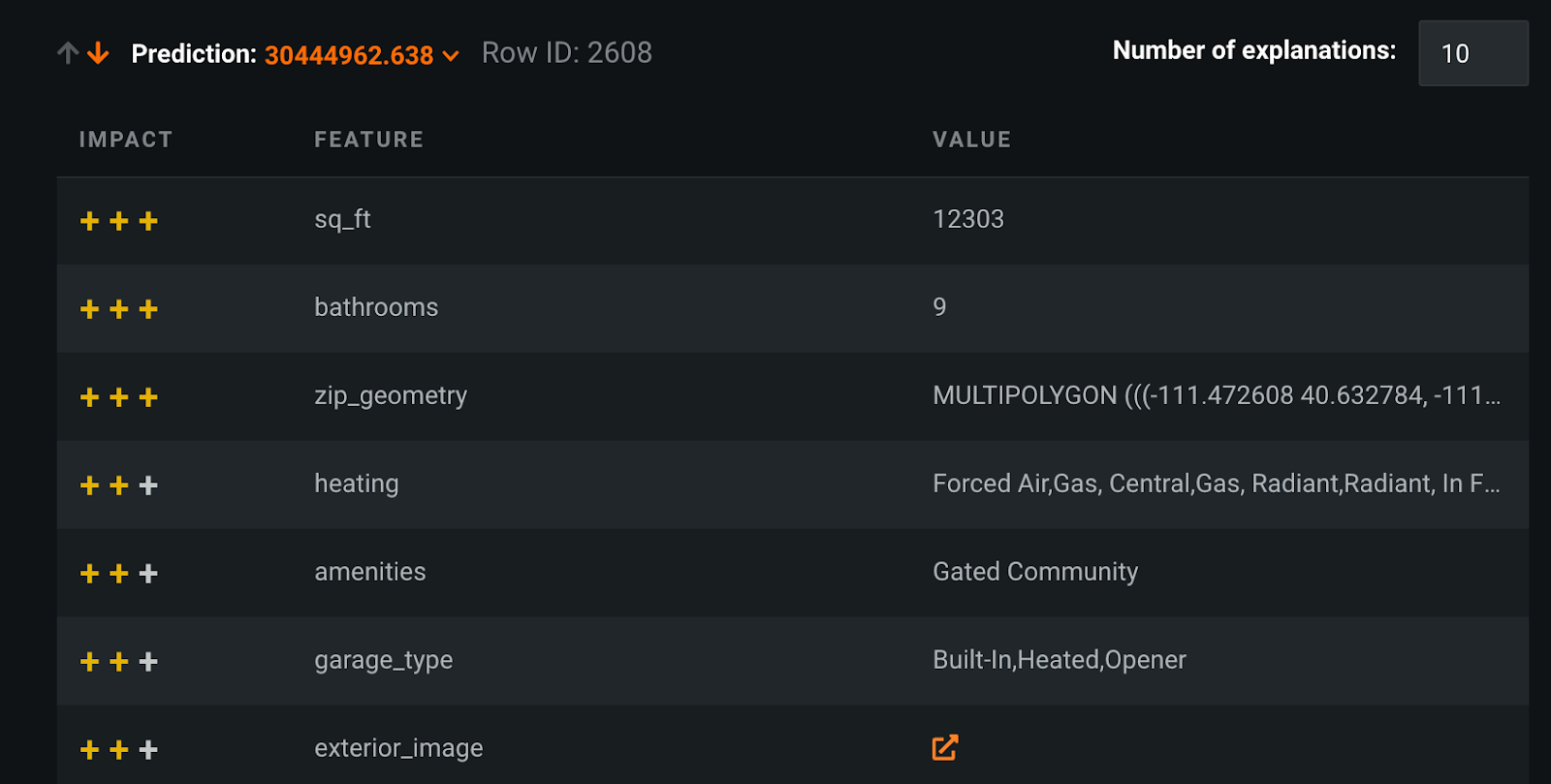
In the example below, we’re looking at the XEMP prediction explanation for row 2,608, which had a prediction of $30,444,962 for sales price. Having a square feet of 12,303, 9 bathrooms, and the specific latitude and longitude mentioned in zip_geometry were the strongest contributors to this prediction. If we were to use SHAP explanations, that would produce actual numbers for each feature value, which add up to the total predicted value.
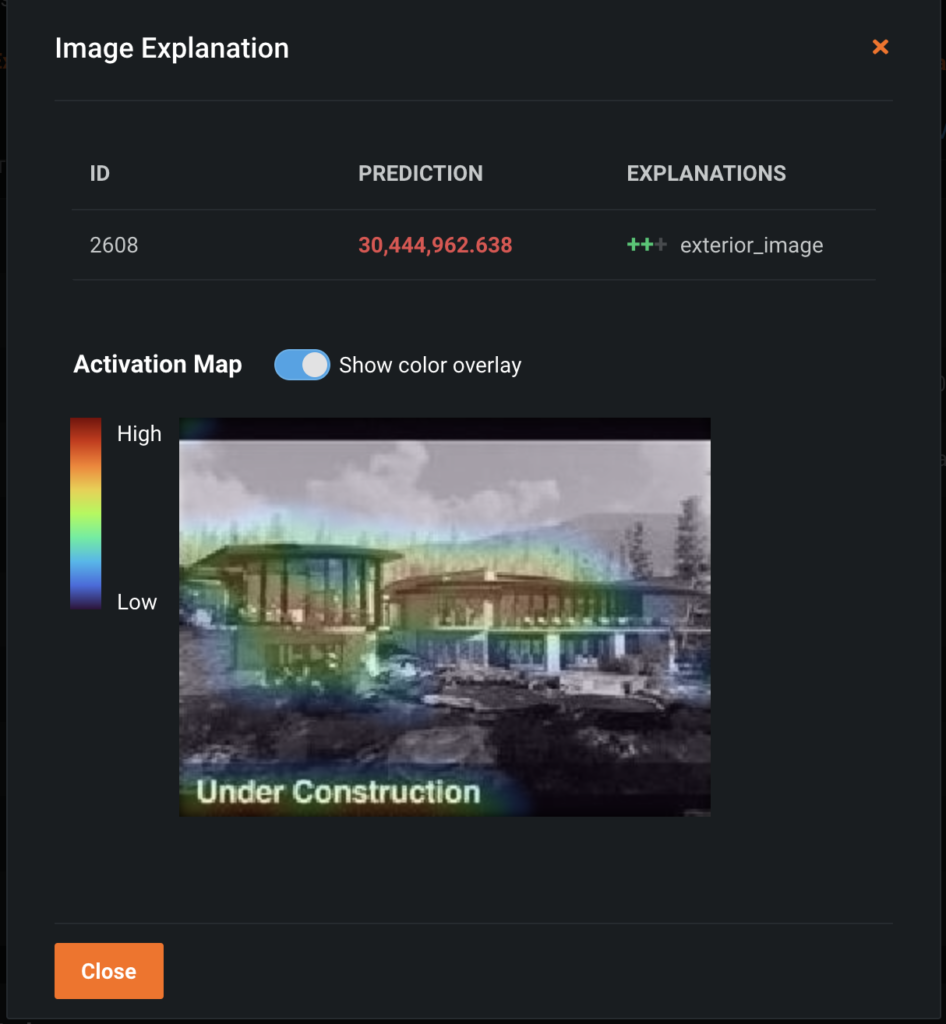
Because this project uses image features, we can also return the Image Explanations for this record’s image features. These are localized Activation Maps for each image in the record. The Image Explanation for exterior_image, which is a highly important feature to this record’s prediction, is shown below.
Model Explainability Wrap-Up
In this section, we explored how to explain a model’s behavior using Global and Local Explanation techniques. The tools we used were only a part of what DataRobot offers. In this project we have additional insights like Accuracy Over Space, Text Mining, and Hotspots. For Time Series projects, we offer Accuracy over Time, Stability, and more. For clustering projects, we offer insights that can help you understand the makeup of the clusters.
MLOps Explainability
Now that we’ve evaluated our model, we’re ready to deploy it. This means the model is ready to receive data and produce predictions. At DataRobot, we call a deployed model, a deployment. Creating a deployment can be done a number of ways in DataRobot’s MLOps product; via the UI, API, or from a tracking agent. I’ve deployed the XGBoost model that we evaluated above and have been sending data to it for scoring. With MLOps explainability, we’re primarily interested in the behavior of the model as it makes predictions and if it’s different at all from training. DataRobot offers three primary explainability features in MLOps: Service Health, Data Drift, and Accuracy. Each of these can be computed for the time period of your choosing.
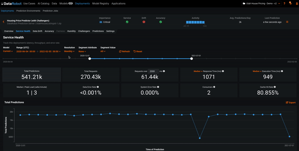
Service Health
One of the first questions stakeholders want to know about a deployment is, what has it been doing? Typically this means finding out how many predictions have been made, how many requests have been made to the deployment, and other performance-related metrics. Service Health answers these questions and more.
In the example below, we’re adjusting the time period for computing the Service Health metrics. We see that both the graph and metrics are recomputed for different time periods. This can help you analyze the activity of the deployment. The time period for all MLOps explainability features can be adjusted in this manner.
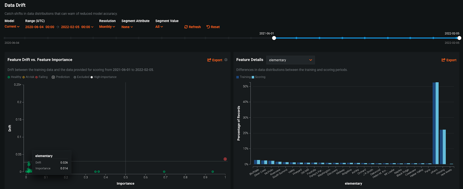
Data Drift
As we send data to the deployment, it is possible that the data being sent for scoring is different from the data used for training the model. This is called data drift and can cause the deployment to become inaccurate. If data drift is occurring, we may want to consider retraining the deployment on the more recent data so it learns the new patterns. Data drift is analyzed using the Data Drift feature.
Below we see two visualizations provided as part of Data Drift. Feature Drift vs Feature Importance plots the importance of a feature (from training time) against the drift of the feature. Features that are important to the model and have a high degree of drift can be a reason to consider retraining the model. DataRobot uses the Population Stability Index to measure drift. The Feature Details plot shows us exactly how a feature has changed from training time. In this example, we’ve selected the feature elementary, which has a high degree of drift relative to the other features. From the Feature Details plot, we see that the scoring data has a higher amount of missing data and more of the “other” category than the training data. We can use the Accuracy feature to see if this drift has affected the accuracy of the deployment.
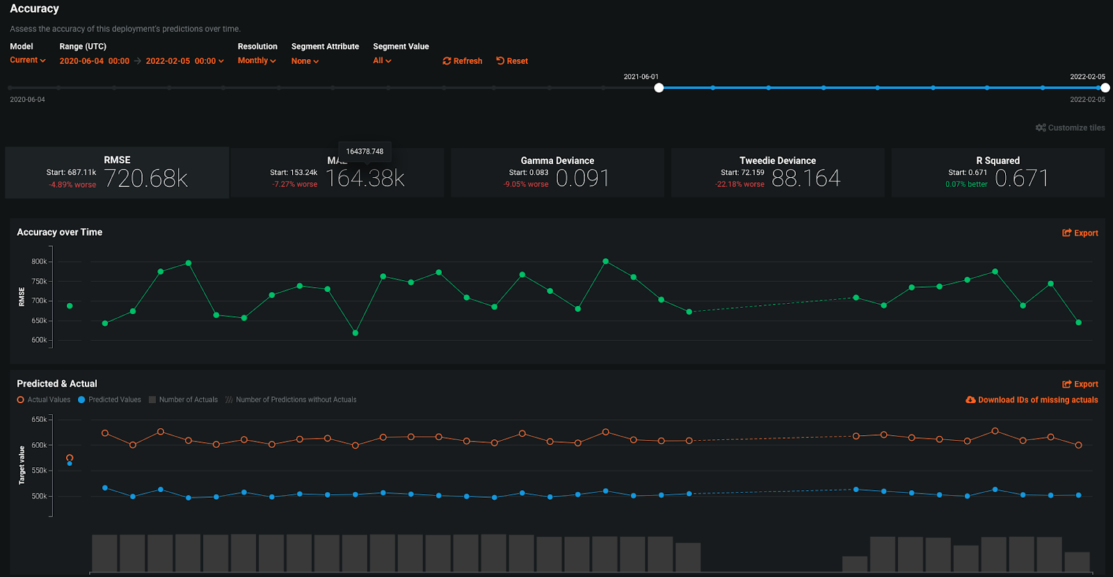
Accuracy
Once the actual values for a predicted row have come in, you can upload those to DataRobot MLOps to compute the accuracy of the deployment. This allows us to view accuracy metrics over time and assess if the deployment requires retraining or other corrective actions to improve its accuracy. Accuracy can be viewed using the Accuracy feature.
In the Accuracy example below, we see two plots: Accuracy over Time and Predicted & Actual. Accuracy Over Time allows us to see the accuracy metric of our choosing plotted over time; in this example, we’re using RMSE. Predicted & Actual shows us the difference between the average predicted and average actual values. We don’t see a significant change in the Accuracy Over Time or the Predicted & Actual plot, telling us this deployment’s accuracy has been stable.
MLOps Explainability Wrap-Up
Using the MLOps explainability features, we’ve analyzed a deployment’s prediction activity, data drift, and accuracy. These tools can help us understand if the deployment requires retraining or if there have been changes in our scoring data since training. We saw a small degree of data drift was occurring, but it did not affect the accuracy of the deployment. Therefore, no retraining is likely required.
End-to-End Explainability Summary
From understanding a model during development to assessing if it’s necessary to retrain a deployed model, explainability helps provide visibility to stakeholders and owners. With DataRobot Explainable AI, you have full transparency into your AI solution at all stages of its lifecycle.

Natalie Bucklin is the Senior Product Manager of Trusted and Explainable AI. She is passionate about ensuring trust and transparency in AI systems. In addition to her role at DataRobot, Natalie serves on the Board of Directors for a local nonprofit in her home of Washington, DC. Prior to joining DataRobot, she was a manager for IBM’s Advanced Analytics practice. Natalie holds a MS from Carnegie Mellon University.
-
How to Choose the Right LMM for Your Use Case
April 18, 2024· 7 min read -
Belong @ DataRobot: Celebrating 2024 Women’s History Month with DataRobot AI Legends
March 28, 2024· 6 min read -
Choosing the Right Vector Embedding Model for Your Generative AI Use Case
March 7, 2024· 8 min read
Latest posts
